
Signup Flow Redesign
How might we create a less
intimidating sign up process?
📙 CONTEXT
What is Wish Local?
Wish Local is a platform for brick and mortar stores to receive new customers. Stores serve as a pickup location for orders placed on the Wish e-commerce app.
🧭 GOAL
Reduce signup friction
The niche nature of the program can already make sign up intimidating. We wanted to reduce the anxiety and barriers that come with sign up.
🚀 RESULTS
Significant increase in acquisition
-
50% increase in signup conversions
-
22% increase in number of applicants with complete data
🧑💻 ROLE
Lead Designer:
Was the sole product designer on the Wish Local team.
🗓 TIMELINE
Feb - Apr 2021
🤝 TEAM
Product Manager: Sabash Karajj
UX Writer: Andrea Dávila
Engineer: Serge Ivanov
Data Scientist: Ilker Karakasoglu
UX Researcher: Jonas Kong
🏁 STATUS
100% launched in all Wish Local countries

01
THE PROBLEM SPACE
What’s wrong with our sign up flow?
Let’s check the data!
I worked with our Wish Local data scientist to compile existing quantitative data to understand the major issues with the current sign up experience.

PROBLEM
Most users aren’t completing the sign up form
Less than 10% conversion rate of users who land on the web sign up page to actually submit the form

HYPOTHESIS
Users are intimidated by the length of the form
All 17 fields of the form are placed on a single page, significantly increasing the user's cognitive load
02
SOLUTION ALIGNMENT
How do we make a massive form more manageable?

COMPETITIVE ANALYSIS
I conducted competitive analysis to understand how other products reduce cognitive load and create an inviting signup experience.
✅ SOLUTION
A multi-screen signup experience
Based on our research, I worked with my PM to determine the best strategy to meet our goals was to break up the page into a multi-screen flow.


HOVER HERE!
Hover over each step to see the process of creating the user journey.
03
DESIGN EXPLORATIONS
What are the different approaches we can take?


PROCESS
STEP 1
Mapping the Basic Flow
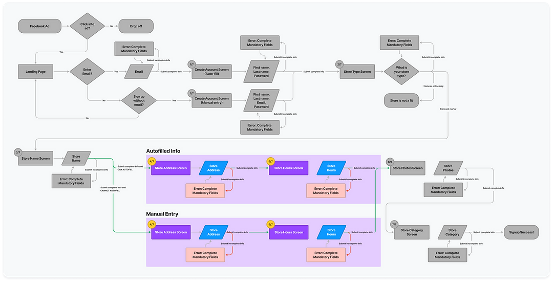
I began by outlining how we would break our lengthy single page form into different screens. We clumped the required formfields into 7 different groups.

PROCESS
STEP 2
Adding Inputs & Decisions
I added to the map what steps would require the user to make a decision or input information.

PROCESS
STEP 3
Accounting for Error States
In order to account for all possible scenarios, I mapped out in which areas it was possible to receive an error.
PROCESS
STEP 4
Utilizing Autofill
To help speed up the user's experience, I mapped out areas where we could use Google API to autofill the user's information based on their store name.
PROCESS
STEP 5
Finalizing the Journey
With all these scenarios in mind, we were able to put together a final journey, and begin design explorations.
PROCESS
EXPLORATIONS
Navigation
Since users were now moving through several new steps,
I wanted to ensure users knew exactly how many screens to expect, rather than navigating blindly.
HOVER HERE!
Hover over each step to see the process of creating the flow navigation.

ITERATIONS
EXPLORATION 1
Using Icons
👍 Pros: Highly visual. Icons help users predict future steps.
👎 Cons:
-
Inflexible, if we were to change the flow in the future.
-
Visual noise. Many icons could detract from the form fields.

ITERATIONS
EXPLORATION 1
Using Icons
👍 Pros: Highly visual. Icons help users predict future steps.
👎 Cons:
-
Inflexible, if we were to change the flow in the future.
-
Visual noise. Many icons could detract from the form fields.

EXPLORATION 2
Adding Headers
👍 Pros: Simplified. Less visual noise
👎 Cons: Redundant. Header and question communicate the same message.
ITERATIONS

✅ EXPLORATION 3 = THE DESIGN WE CHOSE
Sometimes Simple is Better
-
Sets expectations for how many steps are to come.
-
Doesn't include visual noise or clutter to detract from the main content.
-
Is flexible if screens or order changes in the future.
ITERATIONS
HIGH FIDELITY
Ready to test
After several iterations, we had our screens ready for user testing.

04
USABILITY TESTING
What do potential users think?

RESEARCH PLANNING
Recruiting participants and planning the sessions
I consulted with our UX Researcher to plan eight moderated user interviews with participants from usertesting.com
We created a test plan and script, as well as screener questions to ensure our participants matched our ideal user type.
05
USABILITY FINDINGS
What were our findings and design recommendations?

POSITIVE RESULTS
What went well
While we did find some important issues with the flow, there was overwhelmingly positive feedback that we were on the right track.
HOVER HERE!
Hover over each step to see the results and changes from our user testing

NEGATIVE RESULTS AND CHANGES
What didn't go well and how we fixed it

NEGATIVE RESULTS AND CHANGES
What didn't go well and how we fixed it
❌ SETTING INACCURATE EXPECTATIONS
Major issues from user testing:
-
"Your store is in review" made it feel like the process was incomplete and deterred users from downloading
-
Users weren't sure if the app was mobile and how to get to it
-
There was a lack of excitement from completing the flow

NEGATIVE RESULTS AND CHANGES
What didn't go well and how we fixed it
✅ MORE TRANSPARENT NEXT STEPS
-
"Account created" makes the process feel more complete
-
Links to app store and google play help make it easy to transfer to mobile app
-
Mobile app mockup helps clarify that this is a mobile platform and adds more
FINAL DESIGNS
What did we ship?
I created a prototype to share the final designs with stakeholders. View it below.
06
RESULTS
What happened when we
shipped it?

Conversions increased
Sign up conversions increased 50% from a 22% to a 33% conversion rate.

We had more stores with complete info
22% more stores were completing the flow with all of the required data.

Our designs launched to 100%
Our updates were shipped in all 22 Wish Local countries.
.png)